
Description
Website Description: Apple Watch Series 3
Overview
The webpage is a classic example of Apple’s product-first digital marketing strategy. It uses a clean, minimalist layout designed to showcase the device as both a high-tech tool and a fashion accessory.
Design Architecture
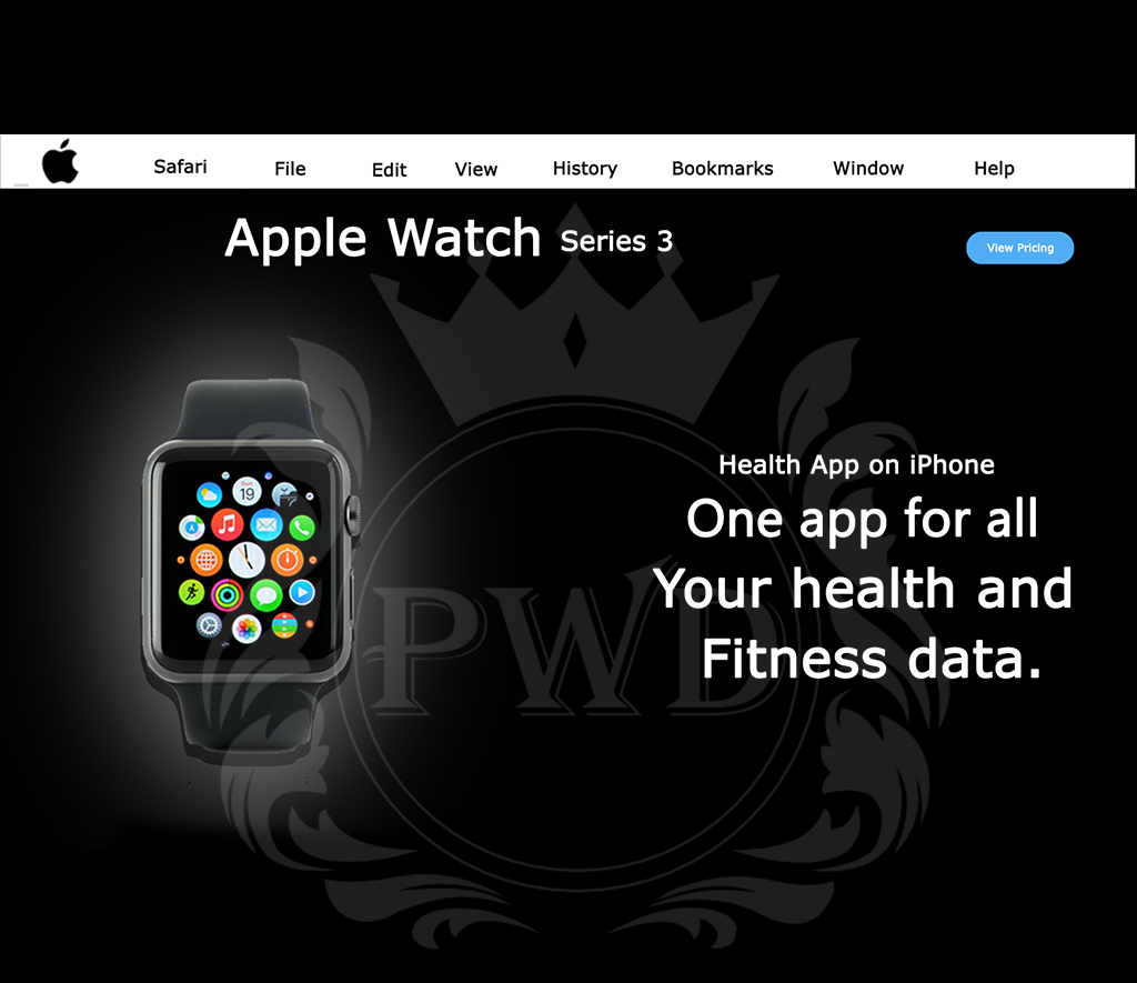
Hero Section: Features a high-resolution, centered image of the Apple Watch. The use of a white background creates a “gallery” feel, making the metallic finishes and vibrant screen colors pop.
Typography: Utilizes bold, sans-serif headers (San Francisco font) to deliver key messages instantly, such as “Stay connected. Even without your phone.”
Visual Hierarchy: The page is structured to guide the user from high-level lifestyle benefits (freedom, fitness) down to granular technical specs.
Core Content Pillars
| Feature | Marketing Focus |
| Cellular Freedom | Focuses on the “Red Dot” crown, signifying LTE connectivity for calls and music on the go. |
| Health & Fitness | Highlights the enhanced Heart Rate app and the “Activity Rings” to motivate daily movement. |
| Durability | Showcases the swim-proof design and the built-in GPS/Altimeter for outdoor enthusiasts. |
User Experience (UX) Elements
Sticky Navigation: A secondary top bar remains visible while scrolling, providing quick access to “Overview,” “Tech Specs,” and the “Buy” button.
Interactive Storytelling: As users scroll, the product often rotates or deconstructs via CSS animations to show internal components like the S3 chip.
Comparison Tool: A public-facing grid that allows users to see the differences between Series 3, Series 1, and Nike+ editions at a glance.