
Title:- Business Corporate
Description
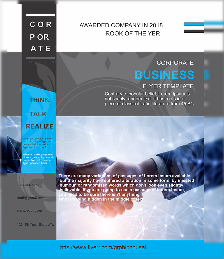
This flyer presents a formal, corporate dégaine with a clean and structured layout. Dominated by greys, blues, and whites, the design attempts to convey professionalism and technological relevance. The handshake image and grid-style lines evoke business trust, connection, and a digital-forward identity, ideal for a company in consulting, IT, or services.
Typography is minimalistic, mixing bold sans-serifs for emphasis with standard fonts for supporting text. Blue accents like “THINK / TALK / REALIZE” along the sidebar aim to add motivational flair, breaking the formality with a slight energetic tone.
However, certain inconsistencies affect its polish. Spelling errors like “ROOK OF THE YER” (instead of “ROOKIE OF THE YEAR”) and awkward filler text compromise credibility and reduce the corporate sharpness. Still, the overall layout reflects a clear attempt to maintain balance and hierarchy, especially in the split-sections and use of white space.
The flyer’s dégaine can be described as “modern corporate with amateur edges.” It has a businesslike framework but lacks final refinements in execution. It may suit internal proposals or concept mockups more than client-facing documents, unless thoroughly corrected.
This dégaine appeals to startups or firms that value a tech-inspired look while still developing brand maturity